Template Instructions
What's Needed
We offer templates in several flavors: Expression, Dreamweaver, and
HTML (generic for any html editing program).
You will need to have the appropriate software, Expression Web V4*
or higher or Dreamweaver CS3 or higher, depending on the template
version you purchase.
*For accurate content and page layout display in
Design View.
Development
Templates are also designed to be flexible. You can add more pages,
delete the pages you do not need, or even rename existing pages. Your
template package will contain all of the pages and images seen in this
preview.
By using your own photos in place of our sample images, you make the
template unique to your business. We recommend you be familiar with the
basics of CSS and HTML.
What's Included
This is a multi-page web template, containing sample pages. All of the
colors (headings, fonts, gradients, background, etc.) can be changed via
the css file.
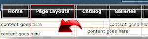
This templates offers a variety of page layout designs, as well as
different options for catalog and product pages. You should choose the
catalog and product pages that best suit your needs and use those
consistently. Most will not use all of the options available.
Responsive Design:
This template is designed to expand and contract depending on the viewing device. This is done through
"media queries" that detects the viewport of the visitor. As the screen becomes smaller, several things
happen:
- The horizontal drop-down menu changes to a vertical "select" drop-down menu. This is "touch friendly" on
mobile devices.
- Some items such as blockquotes, the slideshow, and the footer content blocks are hidden and/or resized. At
some screen sizes, the tabbed content on the product pages are hidden.
- Large product photos are scaled down to fit the screen.
The media queries are located at the bottom of the default.css file; however, we recommend that you not change
these parameters unless you are familiar with how any changes will affect your site.
Adding Your Site Name:
The site name and slogan is plain text. The size, color, and font are set
within the CSS file. To add your own business name and tag line, open the .dwt template(s) and look for the following:
- <div id="logo">
- <h1>Your Business Name</h1>
- <h2>Slogan or Tag Line Goes Here</h2>
- </div>
To change the font, size, color, or other settings, open the default.css file and look for the following:
- #logo h1 {
-
font: normal 2.0em 'Font Name', "Century Gothic", Verdana,
Helvetica, sans-serif; color: #ffffff;
- . . .
- }
Google Fonts:
By linking to a particular font stored on Google’s servers (save on bandwidth + caching benefits), you now
have access to a wide variety of custom fonts. This offers a lot of flexibility for using more decorative fonts
by adding just a touch of code. Quite literally, you can add these fonts into your site in under a minute.
NOTE: You will not see the Google font when in design view. It will be seen when you preview
the site in your browser. Learn more about
Google fonts.
It’s extremely simple. First there is a link to the particular Google font that goes in the head area of each
page:
- <link href="http://fonts.googleapis.com/css?family=Font+Name" rel="stylesheet"
type="text/css">
Next the font name is added to the CSS file:
- h1 {font: normal 30px 'Font Name', "Century Gothic", Verdana, Helvetica,
sans-serif;
- color: #996000;
- margin: .3em 0;
- letter-spacing: 1px;}
Cascading Style Sheets (CSS):
This template relies on an external CSS file that consists of "rules" to tell the browser how to render the
pages. The CSS file sets the fonts and colors for all of the text on the page, will position items on the page
such as the sidebar and content areas, and much more. You can easily modify font colors (links, headings, and
text). Several elements that make up the template are actually graphic images and cannot easily be changed. If
you feel the colors used in this template do not meet your needs, we offer custom design and modification services.
Note: Occasionally when adding your own text and images to your pages, the page may suddenly
seem to lose the formatting. Don't panic. Continue adding your content, then Save the page (Control + S). Now
Refresh the page (F5) and you will see your page "snap" back into position. Continue editing your pages. If the
page loses formatting again, just Save and Refresh the page.
All of our templates are designed to meet current web standards to ensure that your web site will work in today's
web browsers.
Editing Pages and DWT (.dwt) Templates:
All template packages allow you to delete the pages you do not need, create new pages, and rename existing
pages if necessary. Generic HTML templates contain only .html pages.
Expression Web and Dreamweaver versions rely on .dwt templates for the page layout designs. DWT template pages
contain editable and non-editable regions. You edit non-editable regions on the .dwt template(s). This includes
some elements like your site name, navigation, copyright statement, etc. Once you change a .dwt template and save
the page, the changes are then applied to the .html pages that are attached to that .dwt template page.
You edit editable regions on the .html pages. This is your site content, images, etc. To edit the existing
.html pages, just delete our sample content. You can then type your own text and add any additional photos. Note
that you will not be able to edit any “non-editable” regions on these pages.
Creating New Pages In Expression Web: To create a new, blank page based on a .dwt page layout,
go to File > New > Create From Dynamic Web Template. In the dialog box that appears, select the appropriate .dwt
page (if you template offers more than one page layout). When your new page is created, save the page giving it
a unique name and page title. You can then add content to the editable regions.
Creating New Pages In Dreamweaver: To create a new, blank page based on a .dwt page layout,
go to File > New. From the dialog box that appears, choose Page From Template. You can navigate to the Templates
folder of you web to choose the appropriate .dwt page template.
Drop-Down Navigation Menu:
The navigation menu can hold a main topic and one sub-topic level. The sub-topic level will expand on
mouseover and will contract when you move the mouse off the menu item.
 You
can delete main topics (and any associated sub-topics), add new ones, and change the text and links on the
existing menu. You will edit the drop-down menu on the .dwt page templates. Note that the subtopic level will be
difficult to see, so we recommend you edit the menu in code view. If you look at the coding, it should be
relatively easy to make your changes.
You
can delete main topics (and any associated sub-topics), add new ones, and change the text and links on the
existing menu. You will edit the drop-down menu on the .dwt page templates. Note that the subtopic level will be
difficult to see, so we recommend you edit the menu in code view. If you look at the coding, it should be
relatively easy to make your changes.
For a main topic (top link) only, your code will look something like this:
- <li><a
href="../index.html">Home</a></li>
For a main topic that contains sub-topics, your code will look something like this:
- <li><a
href="../page.html">Main Topic</a>
- <ul>
- <li><a
href="../page.html">Sub-Topic 1</a></li>
- <li><a
href="../page.html">Sub-Topic 2</a></li>
- <li><a
href="../page.html">Sub-Topic 3</a></li>
- <li><a
href="../page.html">Sub-Topic 4</a></li>
-
</ul>
-
</li>
Once you have your menu completed on one .dwt page, copy the entire menu and paste it into any additional
.dwt page templates you will be using. Save your pages and allow the changes to update on the .html pages.
Save and you're done.
- <nav
id="mainnav">
-
copy all coding that appears between the opening and closing nav tags
-
</nav>
Font sizes and colors, background colors, sub-topic block width, margins, paddings, etc. are all controlled
in the default.css page.
FAQ Page:
FAQ pages typically have several questions along with their answers. To make this easily readable, we have
used a definition list <dl>. The definition topic <dt> and the definition description <dd> are given special classes.
If you wish to change the way the questions and answers look, you can edit the classes in the CSS file.
- <dl>
- <dt class="question">Question</dt>
- <dd class="answer">
- <p>Your answer goes here.</p>
- </dd>
- </dl>
Tabbed Content:
We have added a tabbed content block on the sample product pages. This allows for several blocks of content
to be displayed in a relatively small space. You can, however, add a tabbed content block to any page.
The Tabs: You can change the text that appears on the tabs while in Design View. You can add
more tabs if needed by following the convention used below. A fourth tab would have rel="tab4", etc.
- <ul class="tabs">
- <li class="active" rel="tab1"> Description</li>
- <li rel="tab2"> Specifications</li>
- <li rel="tab3"> Additional Views</li>
- </ul>
The Content: The content that appears below each tab is hidden by default using a bit of
jQuery and CSS. You will have to edit the content while in Code or Split View. You can add paragraphs, lists,
images, etc.
- <div id="tab1" class="tab_content">
- ...your content goes here
- </div>
- <div id="tab2" class="tab_content">
- ...your content goes here
- </div>
JavaScript Calendar:
This template includes a simple JavaScript calendar. Note that you will not be able to see the calendar while
in Design view. This script is set to show the current date only. If you do not wish to include the calendar,
you can delete it from the code.
- <p><script type="text/javascript" src="calendar.js"></script></p>
To change the size of the fonts in the calendar or to change the colors, you will need to edit the
calendar.js file. [Credit for this application: http://www.bmgamble.com. While this script is
free, we recommend that you give credit for the application.]
JavaScript Lightbox:
Your template contains a JavaScript Lightbox script. You can use the lightbox
feature on any photo in your site; it is not limited to only the product or gallery pages. The Lightbox JavaScript
consists of several files. We recommend that you do not move or edit any of these files.
The Lightbox allows you to click on a small photo and have a larger image appear in a semi-transparent overlay
that will appear on top of the page. The script will automatically size itself, so your images can be different
sizes.
First insert your small photo onto the page. Create a hyperlink to the larger photo. Create a hyperlink to
the larger photo. Switch to code view and add the rel="lightbox" which activates the JavaScript. If you wish to
have a title appear, add the title attribute as shown in the example.
- <a href="images/gallery/product1lg.jpg" rel="lightbox" title="Your product description goes here"><img alt="sample photo" src="images/gallery/product1.jpg"></a>
To click through a group of images, add a group name: rel="lightbox[groupname]".
The "Previous" and "Next" buttons will now automatically appear.
- <a href="images/gallery/product1lg.jpg" rel="lightbox[groupname]" title="Your product description goes here"><img alt="sample photo" src="images/gallery/product1.jpg"></a>
[Credit
for this application: http://lokeshdhakar.com/projects/lightbox2/.]
Template Use:
This is a free template, but does have some conditions.
Please read carefully:
- You are welcome to use this template for one personal and one
commercial site only.
- By downloading this free template, you are bound by the terms of our
License Agreement. Our full
End User License Agreement
is available on our site.
- You must keep our credit link, located at the bottom of each page, in
place and visible. If you do not want to keep the credit link in place, do
not use the template.
- This free template does not have all of the "bells and whistles" we
include in our for-sale templates. We do not make modifications to free
templates.
- You are welcome to make changes and modifications to the template, but
you may not offer our template for download or for sale.
A Checklist:
There always seems to be a rush to publish a new site. Before going live with your site, take a minute and
review our list of items that should be completed first!
- Change the page title on all pages as appropriate.
- Preview all pages by going to File > Preview in Browser. It's a good idea to check your
site in more than one browser.
- Modify the description meta tags on each page.
- Change or add alt text to each photo used on your site. In the template, we typically
have "sample" as the alternate text or it is left blank.
- Spell check each page.
- Check each page in Code View. If you see embedded styles that are caused by using the
formatting toolbar (.style1, .style2, .autostyle1, autostyle2), note that these embedded styles may conflict
with our external css file. You can find details on how to clean up these styles by visiting our
Help Center.
- Upload your new site to your web hosting space. You do NOT need to upload the Templates
folders.
- Important! Remember that it is against our Terms of Use to upload pages that contain
our demo text. Edit first, then upload!
Need Help Fast?
Need more? We also offer a variety of helpful resources as well as design services. Please visit our web site
at RTBWizards.com.